Careful Colour Choices in SEND Classrooms
20 September 2023
Selecting the right colours and tones when decorating a classroom for students with special educational needs and disabilities (SEND) is very important. The right colours can not only help with concentration and wayfinding but can also be comforting to those with hyper-sensitivity and visual impairments.
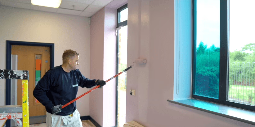
Bagnalls are proud to have completed several SEND classroom projects, providing a safe and inclusive space for students to learn. We spoke to Dawn Scott, a colour specialist at our partner AkzoNobel, to find out more about how colour can affect a learning environment.
Bagnalls: Thank you for taking the time to speak to us Dawn, we would love to hear your insights into the power of colour, especially in SEND school environments.
Dawn: It’s great to be able to share my knowledge and highlight the great work we do to ensure a positive learning environment in SEND classrooms.
Bagnalls: We know that primary colours can be overwhelming and distracting due to their highly chromatic nature. Which colours offer a great alternative option for use in multi-sensory classrooms?
Dawn: It’s best to avoid yellows, reds and oranges in classroom decoration as these tones can trigger hyper-sensitivity and create an overwhelming atmosphere. Off-whites and neutral tones are preferable to pure, brilliant whites as they have less luminance, meaning they reflect less light and reduce glare. This increases concentration and lessens eye fatigue.
Bagnalls: Can different tones of colour help promote well-being and independence?
Dawn: Yes, colour can facilitate inclusivity. Carefully delineated colours can enable those with visual impairments to navigate more confidently through the building and help students create memorable focal points, assisting with wayfinding. Pupils recognise colours before they recognise the alphabet. Therefore, colour-coding things, like coat pegs and drawers for younger learners and subject areas or departments for older learners, can help children to gain independence.
Bagnalls: What’s the best way to approach the colour palette selection for a SEND project to ensure a positive learning environment?
Dawn: The end user group and the intended use of the space should always be considered when selecting your colours. Neutral colour schemes will create a calming atmosphere and can be enhanced with the addition of colourful furniture, which has the flexibility to be moved around. Each teaching space should have a brighter feature colour applied to an appropriate area, such as the wall behind the whiteboard or screen, to capture attention and aid with student focus.
Bagnalls: Does age group have a bearing on the colours selected?
Dawn: It does! Colour sophistication develops as we grow. Fresher, brighter colours are more appropriate and fun for a younger audience, whilst greyed-off, muted and richer tones are more trend-led and therefore aimed at older learners.
Bagnalls: We know the right colour palette can create soothing, restorative spaces. Which colour combinations work best to create a calming space?
Dawn: The best colours to craft a calming atmosphere are harmonious, muted colours. If a focal point is not necessary for the space, using the same tone across all walls can bring a nurturing, insular feeling. Slightly warmer, muted tones work well to maintain a feeling of warmth and interest and avoid a stark or bland feel.
Bagnalls: Some paints feature mould-inhibiting or scuff-resistant properties. How important are these specialist paints when designing a SEND classroom?
Dawn: These special products, like Dulux Trade’s Scuffshield and Sterishield, are great for use within schools, colleges and universities. Scuffshield is a tough, water-based paint. Resistant to the marks usually left by bags and shoes, it keeps walls looking fresher for longer. Perfect for use in high-traffic areas, it also offers stain resistance and can be gently cleaned. Sterishield is a quick-drying, water-based coating which contains anti-microbial additives, inhibiting the growth of bacteria and viruses, making it perfect for use within a school!
Bagnalls: Is it important to consider the direction and amount of light within a room when choosing your colour palette?
Dawn: Yes, this is crucial! Different light sources and surface finishes affect the appearance of colour. For instance, matt finishes provide a truer colour reflection. It’s important to consider light reflectance values (LRVs) when dealing with colour and contrast. This is the measure we use when calculating differences between critical adjoining surfaces. Using cooler tones in southerly sunny classrooms and warmer shades in northerly shady rooms will help balance the reflection of light and make the space feel comfortable. If glare is an issue, try using deeper tones – putting a stronger accent colour opposite your window will absorb some of the glare and bounce less light around the room. If you want to increase the brightness in your space, light, neutral walls opposite windows will reflect more light into your room.
It was so interesting to hear from Dawn about the various considerations which go into selecting colour palettes for learning spaces. It’s so important to consider light, shade and colour within a SEND classroom, to ensure your space is conducive to learning and creates a calming, welcoming space for all students.
To discover more about our work on SEND classrooms, check out our case study on our project with AkzoNobel at Firwood High School, where we decorated two multi-sensory classrooms.